
-Ella Fitzgerald, “Paper Moon”

I rejected a lot of quotes before selecting this one. Because I think it sums up my experience over the last 19 months.
(Now if only there was a PS about appreciating your own mother, it would be perfect!)
Happy Mother’s Day!
I’m still reading…but honestly a little bit ready to get through Anne’s House of Dreams so I can get back into “real” reading.
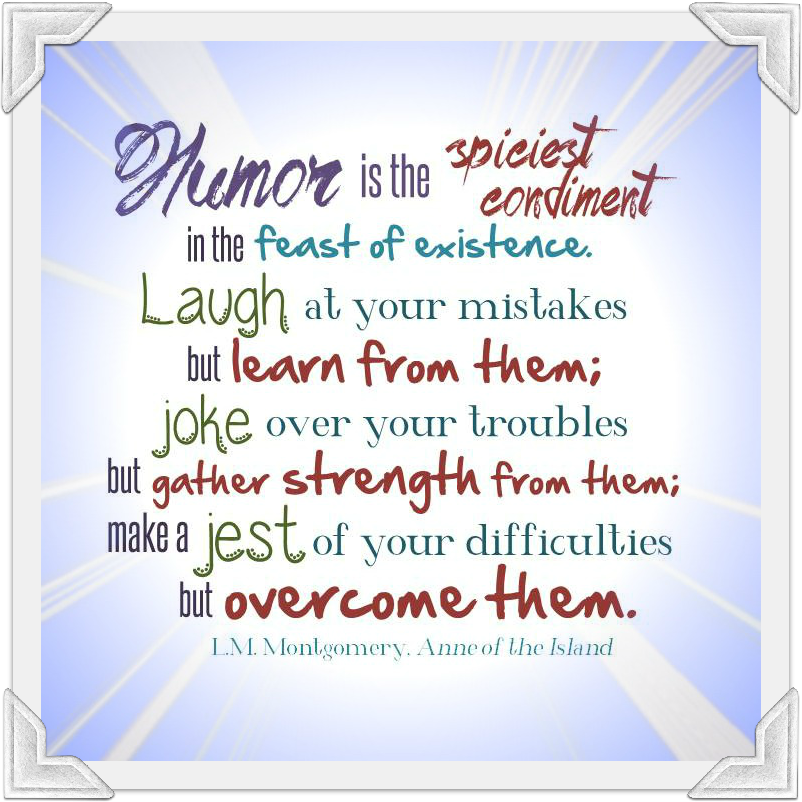
In the meantime, I’m still having fun with this typography thing. Although I might be delving too deeply into various background patterns. It’s starting to look like something that might be found on a Geocities website circa 2001, with glittery rain falling and roses waving back and forth. I’ll scale it back for the next one.
I read Anne of Green Gables in middle school, but I never got around to reading any of the sequels. About two years ago, I found sequels 2 through 5 at a used bookstore for $2 each, so I bought them, but then just stashed them on the shelf. (It wasn’t the first time.) Apparently there is at least one more that I should track down.
So I’m currently reading my way through the first 5 books (I did start at the beginning with Green Gables), which is just delightful. Gilbert Blythe, I’m pleased to report, is just as much of a hottie as certain of my friends have always maintained. Anne and Gilbert getting together, although obvious from the beginning, is a welcome payoff in Anne of the Island (#3).
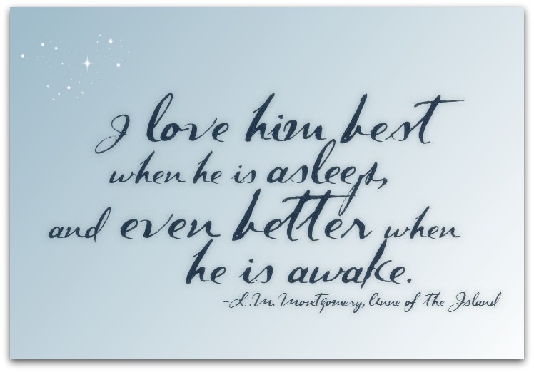
This quote came from a letter Anne’s mother wrote to her husband, about Anne as a baby. (Obviously I changed the pronouns.) (The font is called Dark Roast; the arrangement is mine.)
From that same book, there’s another quote, longer and more complex, which I’m hoping to tackle next.
Second attempt!
1. I emphasized the words that are actually important to the message.
2. I got rid of some of the white space between words.
3. I kept it to three fonts.
4. Fonts that don’t come standard with MS Word.*

*Fonts (in order of appearance):
Wonderland by jully1780
Hand of Sean by Nice and Ripe Ltd
Wednesday by bythebutterfly.com
I’ve been fascinated by typography for awhile now. I think because I’m not really an artist, but this is a form of art that incorporates words, so I feel like it’s more up my alley. But it’s still art, and so it’s still intimidating.
So I’ve been really wanting to try it, but I just had no idea where to start. I kept thinking this would be a good subject for a class. If I wanted to take a class, and I had the time and the money and the energy. I looked up Intro to Typography books on Amazon, but I didn’t order any. I pushed “typography thing” down and down on my to-do list, and then eventually moved it onto my “Long-Term To Do” list.
And then, this summer, surprise! A bunch of my friends’ babies starting turning 1. And I thought I should make something to commemorate the occasion. I missed a couple birthdays, and then I realized that my next friend with the birthday baby was an actual GRAPHIC DESIGNER, so she probably wouldn’t want something that I had cobbled together as a first try.
So I decided to just Make Something, and it could be a general, out-in-the-universe, Happy First Birthday to All the Babies.
This is what I made.

Afterwards, I looked at it and saw – off the top of my head – several things that I would change. But I showed it to my friends anyway. And they were (of course) positive and encouraging and full of constructive criticism. I am eager to take another swing at this thing.
When I look at this, I see a first attempt filled with rookie mistakes. (And surely lots of mistakes that I can’t even see.) (Yet.)
But mostly I see a leap that I’ve been pondering for ages, into an unknown and exciting new territory.
